The Quality of Competition Over Time
An Age Spectrum Analysis
Regarding the Quality of Competition in Major League Baseball Over time, one objective measure that we could get is the concentration of talent around the peak ages. The peak age for baseball player contributions, as we all know, is 27; actually, 26 and 27 are essentially equal. 26 measures as equal or slightly superior to 27 if you look at players who are established in the league by age 24 or 23 or 22 or something; 27 just measures as a little ahead of 26 in aggregate contribution because the process of players getting established in the major leagues is not 100% complete by age 26. At age 26, a small but not trivial number of players are still rookies or are still earning playing time.
Suppose that you look at teams selected from different ages, and for this thought experiment we do not rely on these being major league players. Suppose that we compare a team of 10-year-old players to a team of 13-year-old players. Who do you think will win? Suppose that we compare a team of 16-year-olds to a team of 13-year-olds, or a team of 19-year-olds to a team of 16-year-olds. Of course we know that, up to a point, the older, more mature team will dominate.
Or suppose that we have a team of 70-year-olds playing a team of 60-year-olds, or a team of 70-year-olds playing a team of 80-year-olds. My point is that we know beyond any question that the closer a group of players is to the peak age, the stronger the team is likely to be. Also, we know from copious research that the peak age for a professional player is 26 to 27, although it is likely that the peak age for non-professional athletes is somewhat younger.
Suppose we state this relationship, in professional terms, in this way. A player who is 26 or 27 years old has a presumed "age strength" of 100, which is really 100%; we’ll get there. For each year that a player is younger than age 26, we reduce the 100 by the square of the difference between 26 and the age. Thus, as the score for age 26 is 100, the age/strength score for age 25 is 99, for age 24, 96; for age 23, 91; for age 22, 84; for age 21, 75; for age 20, 64; for age 19, 51; for age 18, 36; for age 17, 19; and for age 16 or younger than 16, zero.
Going forward from age 27, we do the same, but at one-half the speed. Thus, we state the age/strength score associated with each age is as follows:
|
Age
|
Score
|
|
Age
|
Score
|
|
Age
|
Score
|
|
Age
|
Score
|
|
16
|
0
|
|
24
|
96
|
|
32
|
93.75
|
|
40
|
57.75
|
|
17
|
19
|
|
25
|
99
|
|
33
|
91
|
|
41
|
51
|
|
18
|
36
|
|
26
|
100
|
|
34
|
87.75
|
|
42
|
43.75
|
|
19
|
51
|
|
27
|
100
|
|
35
|
84
|
|
43
|
36
|
|
20
|
64
|
|
28
|
99.75
|
|
36
|
79.75
|
|
44
|
27.75
|
|
21
|
75
|
|
29
|
99
|
|
37
|
75
|
|
45
|
19
|
|
22
|
84
|
|
30
|
97.75
|
|
38
|
69.75
|
|
46
|
9.75
|
|
23
|
91
|
|
31
|
96
|
|
39
|
64
|
|
47
|
0
|
24-year-olds are equivalent to 31-year-olds at .96, meaning that the difference between those ages and peak age is pretty much insignificant. 22-year-olds are equivalent to 35-year-olds at .84, a meaningful but not prohibitive barrier. There are successful 22-year-olds in the major leagues and successful 35-year-olds, but not very many, because if you lose 16% of your ability, that’s usually enough to end your career. 20-year-olds are equivalent to 39-year-olds, at 64%. There just a handful of players so skilled that they will own major league jobs at age 20, or at age 39.
At age 38, for example. . .38-year-olds are 11 years removed from their peak, which is equivalent to 5.5 full steps. 5.5 squared is 30.25; 100 minus 30.25 is 69.75, so 38-year-olds are presumed to retain 69.75% of their peak skill level.
You will note that the chart ends at age 16 and at age 47, and you will also note, if you study it, that there are no 16-year-olds or 47-year-olds in the major leagues; yes, I know there have been a handful of such players in major league history, but it is nowhere near 1% of the total population of players at either end. Those are meaningful zeroes.
These numbers are referring to groups of players, not to individuals—groups, like a team or a league. Think of it this way: suppose there was a league somewhere, a league in Yugoslavia or Bolivia or Portlandia, and suppose that in that league there was a 19-year-old phenom who hit .357 with 56 home runs and 171 RBI. What would that suggest to you about the quality of the league?
There are events very much like that in the early history of the game. In 1879 a 19-year-old pitcher won 47 games in the National League. In 1880 he dropped off to 39 wins, but a different 20-year-old won 43 games, and a third 20-year-old won 34. These events tell us something about the quality of the league competition at that time. That level of age-aberrant performance disappeared from baseball in its early days, but over time, out-of-age-range performances have become steadily less common.
I am confusing there two slightly different things: the presence of players with out-of-age range bulk performance, and exceptional domination of the league by a relatively few players. The introduction confuses the two, but the analysis doesn’t.
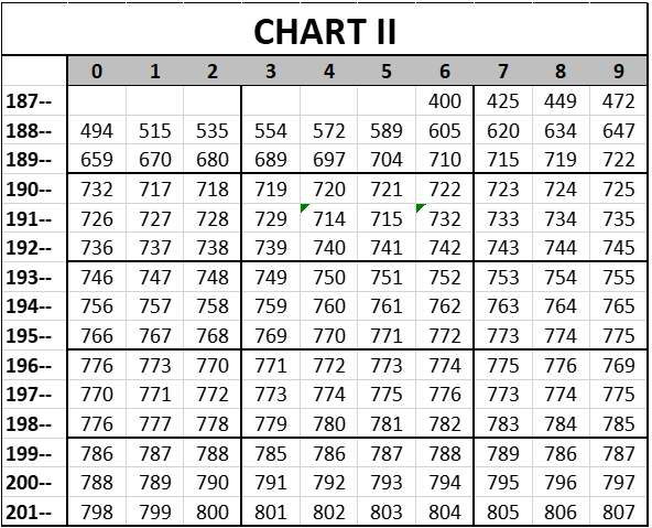
Suppose that you take every player in a given league, and record his plate appearances, if he was a hitter, or his batters faced, if he was a pitcher, and suppose that we weight each of those by the strength score associated with the player’s age. For the sake of clarity, what we are doing is using the age spectrum of the players in a league to indicate the strength of the league, relative to other leagues. Let’s do the 1879 Providence Grays—the team for which Monte Ward won 47 games at the age of 19—to illustrate the process. The Grays used only 17 players all season, only 2 pitchers. These are the plate appearances/batters faced by each of them.
|
Batter
|
PA
|
|
Paul Hines
|
417
|
|
George Wright
|
401
|
|
Mike McGeary
|
379
|
|
Jim O'Rourke
|
375
|
|
Monte Ward
|
371
|
|
Tom York
|
361
|
|
Joe Start
|
324
|
|
Lew Brown
|
233
|
|
Bill Hague
|
212
|
|
Bobby Mathews
|
180
|
|
Emil Gross
|
136
|
|
Jack Farrell
|
51
|
|
Denny Sullivan
|
20
|
|
Dan O'Leary
|
7
|
|
Rudy Kemmler
|
7
|
|
Doug Allison
|
5
|
|
Bill White
|
4
|
| |
|
| |
|
|
Pitcher
|
BF
|
|
Monte Ward
|
2425
|
|
Bobby Mathews
|
779
|
These are the ages for each of these players:
|
Batter
|
PA
|
Age
|
|
Paul Hines
|
417
|
24
|
|
George Wright
|
401
|
32
|
|
Mike McGeary
|
379
|
28
|
|
Jim O'Rourke
|
375
|
28
|
|
Monte Ward
|
371
|
19
|
|
Tom York
|
361
|
28
|
|
Joe Start
|
324
|
36
|
|
Lew Brown
|
233
|
21
|
|
Bill Hague
|
212
|
27
|
|
Bobby Mathews
|
180
|
27
|
|
Emil Gross
|
136
|
21
|
|
Jack Farrell
|
51
|
21
|
|
Denny Sullivan
|
20
|
21
|
|
Dan O'Leary
|
7
|
22
|
|
Rudy Kemmler
|
7
|
19
|
|
Doug Allison
|
5
|
32
|
|
Bill White
|
4
|
18
|
| |
|
|
| |
|
|
|
Pitcher
|
BF
|
Age
|
|
Monte Ward
|
2425
|
19
|
|
Bobby Mathews
|
779
|
27
|
This adds the age/strength score for each of those players, based on his age:
|
Batter
|
PA
|
Age
|
Age/St
|
|
Paul Hines
|
417
|
24
|
96
|
|
George Wright
|
401
|
32
|
93.75
|
|
Mike McGeary
|
379
|
28
|
99.75
|
|
Jim O'Rourke
|
375
|
28
|
99.75
|
|
Monte Ward
|
371
|
19
|
51
|
|
Tom York
|
361
|
28
|
99.75
|
|
Joe Start
|
324
|
36
|
79.75
|
|
Lew Brown
|
233
|
21
|
75
|
|
Bill Hague
|
212
|
27
|
100
|
|
Bobby Mathews
|
180
|
27
|
100
|
|
Emil Gross
|
136
|
21
|
75
|
|
Jack Farrell
|
51
|
21
|
75
|
|
Denny Sullivan
|
20
|
21
|
75
|
|
Dan O'Leary
|
7
|
22
|
84
|
|
Rudy Kemmler
|
7
|
19
|
51
|
|
Doug Allison
|
5
|
32
|
93.75
|
|
Bill White
|
4
|
18
|
36
|
| |
|
|
|
| |
|
|
|
|
Pitcher
|
BF
|
Age
|
Age/St
|
|
Monte Ward
|
2425
|
19
|
51
|
|
Bobby Mathews
|
779
|
27
|
100
|
We multiply each player’s plate appearances or batters faced by his age/strength score, and divide by 100. We’ll call that the Age Contribution or Age/Strength Contribution:
|
Batter
|
PA
|
Age
|
Age/St
|
Age Cont
|
|
Paul Hines
|
417
|
24
|
96
|
400.32
|
|
George Wright
|
401
|
32
|
93.75
|
375.9375
|
|
Mike McGeary
|
379
|
28
|
99.75
|
378.0525
|
|
Jim O'Rourke
|
375
|
28
|
99.75
|
374.0625
|
|
Monte Ward
|
371
|
19
|
51
|
189.21
|
|
Tom York
|
361
|
28
|
99.75
|
360.0975
|
|
Joe Start
|
324
|
36
|
79.75
|
258.39
|
|
Lew Brown
|
233
|
21
|
75
|
174.75
|
|
Bill Hague
|
212
|
27
|
100
|
212
|
|
Bobby Mathews
|
180
|
27
|
100
|
180
|
|
Emil Gross
|
136
|
21
|
75
|
102
|
|
Jack Farrell
|
51
|
21
|
75
|
38.25
|
|
Denny Sullivan
|
20
|
21
|
75
|
15
|
|
Dan O'Leary
|
7
|
22
|
84
|
5.88
|
|
Rudy Kemmler
|
7
|
19
|
51
|
3.57
|
|
Doug Allison
|
5
|
32
|
93.75
|
4.6875
|
|
Bill White
|
4
|
18
|
36
|
1.44
|
| |
|
|
|
|
| |
|
|
|
|
|
Pitcher
|
BF
|
Age
|
Age/St
|
Age Cont
|
|
Monte Ward
|
2425
|
19
|
51
|
1236.75
|
|
Bobby Mathews
|
779
|
27
|
100
|
779
|
And here we add the batter and pitcher totals:
|
Batter
|
PA
|
Age
|
Age/St
|
Age Cont
|
|
|
Paul Hines
|
417
|
24
|
96
|
400.32
|
|
|
George Wright
|
401
|
32
|
93.75
|
375.9375
|
|
|
Mike McGeary
|
379
|
28
|
99.75
|
378.0525
|
|
|
Jim O'Rourke
|
375
|
28
|
99.75
|
374.0625
|
|
|
Monte Ward
|
371
|
19
|
51
|
189.21
|
|
|
Tom York
|
361
|
28
|
99.75
|
360.0975
|
|
|
Joe Start
|
324
|
36
|
79.75
|
258.39
|
|
|
Lew Brown
|
233
|
21
|
75
|
174.75
|
|
|
Bill Hague
|
212
|
27
|
100
|
212
|
|
|
Bobby Mathews
|
180
|
27
|
100
|
180
|
|
|
Emil Gross
|
136
|
21
|
75
|
102
|
|
|
Jack Farrell
|
51
|
21
|
75
|
38.25
|
|
|
Denny Sullivan
|
20
|
21
|
75
|
15
|
|
|
Dan O'Leary
|
7
|
22
|
84
|
5.88
|
|
|
Rudy Kemmler
|
7
|
19
|
51
|
3.57
|
|
|
Doug Allison
|
5
|
32
|
93.75
|
4.6875
|
|
|
Bill White
|
4
|
18
|
36
|
1.44
|
|
|
Total Batters
|
3483
|
|
|
3073.648
|
.882
|
| |
|
|
|
|
|
|
Pitcher
|
BF
|
Age
|
Age/St
|
Age Cont
|
|
|
Monte Ward
|
2425
|
19
|
51
|
1236.75
|
|
|
Bobby Mathews
|
779
|
27
|
100
|
779
|
|
|
Total Pitchers
|
3204
|
|
|
2015.75
|
.629
|
| |
|
|
|
|
|
|
Total Batters
|
3483
|
|
|
3073.65
|
.882
|
|
Total Pitchers
|
3204
|
|
|
2015.75
|
.629
|
|
Total for team
|
6687
|
|
|
5089.398
|
.761
|
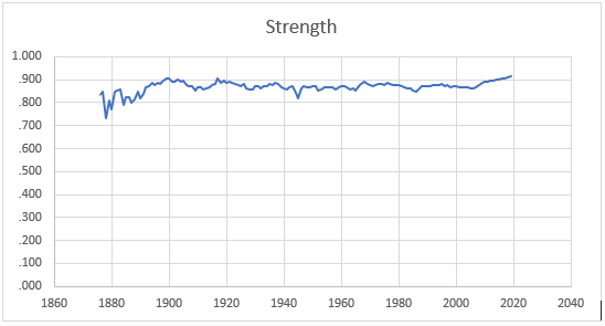
The Age/Strength Score for a team is the sum of the age/strength contributions of the players, divided by the opportunity numbers, plate appearances and batters faced. The Age/Strength Score for this team is .882 for the batters, .629 for the pitchers, and .761 overall.
Suppose that we do the same analysis for every team in the National League in 1879. For the league as a whole, 1879 National League, the Age/Strength score for hitters is .913, and for pitchers, .884. The parallel numbers for the 2019 season (both leagues combined) are .955 for hitters, and .958 for pitchers. However, we will not use those numbers in the subsequent analysis; actually, we will use the squares of those numbers. It has to do with "appropriate degree of separation". When we square these two numbers and then combine them into one, the Age/Strength Score for the 1879 season is .808, and for 2019, .915. In essence, the 2019 major leagues are estimated to be about 13% stronger than the National League in 1879, just based on the fact that the players now are clustered more tightly in age around the peak ages of 26 and 27, with fewer players at off-peak ages, and no 19-year-olds at all pitching 587 innings.
The .915 figure from 2019 was an all-time high. The players from 2019 cluster in age around 26 and 27 to a greater extent than they did in any previous season. If you believe, as most people do, that the quality of competition has gotten better over time, this may not surprise you, and also, it may not surprise you to learn that the previous high-water mark was in 2018. It may not surprise you to learn that among the ten highest figures ever for a season, the seasons of 2017, 2016, 2015 and 2014 are on the list.
It might surprise you, however, to learn what the highest Strength Score based on Age Spectrum Analysis was, before a new high was reached in 2018. The previous high-water mark was in 1900. The 1900 season had an Age/Strength score of .907, a "record" that stood for 118 years.
|
Year
|
Age Strength
|
|
2019
|
.915
|
|
2018
|
.912
|
|
1900
|
.907
|
|
2017
|
.906
|
|
1899
|
.905
|
|
1917
|
.905
|
|
2016
|
.904
|
|
1903
|
.903
|
|
2015
|
.901
|
|
2014
|
.900
|
The numbers have improved over time, but not uniformly; there’s been some ups and downs. This chart shows the Age Strength Score for every season since 1876, with low marks highlighted in brown, and high marks highlighted in green:
|
Year
|
Age Strength
|
|
Year
|
Age Strength
|
|
Year
|
Age Strength
|
|
Year
|
Age Strength
|
|
1876
|
.833
|
|
1912
|
.860
|
|
1948
|
.865
|
|
1984
|
.862
|
|
1877
|
.848
|
|
1913
|
.865
|
|
1949
|
.866
|
|
1985
|
.854
|
|
1878
|
.733
|
|
1914
|
.868
|
|
1950
|
.871
|
|
1986
|
.850
|
|
1879
|
.808
|
|
1915
|
.875
|
|
1951
|
.874
|
|
1987
|
.859
|
|
1880
|
.770
|
|
1916
|
.883
|
|
1952
|
.853
|
|
1988
|
.872
|
|
1881
|
.850
|
|
1917
|
.905
|
|
1953
|
.860
|
|
1989
|
.874
|
|
1882
|
.851
|
|
1918
|
.887
|
|
1954
|
.868
|
|
1990
|
.874
|
|
1883
|
.858
|
|
1919
|
.898
|
|
1955
|
.867
|
|
1991
|
.871
|
|
1884
|
.792
|
|
1920
|
.889
|
|
1956
|
.865
|
|
1992
|
.876
|
|
1885
|
.823
|
|
1921
|
.892
|
|
1957
|
.869
|
|
1993
|
.876
|
|
1886
|
.822
|
|
1922
|
.886
|
|
1958
|
.858
|
|
1994
|
.877
|
|
1887
|
.799
|
|
1923
|
.883
|
|
1959
|
.867
|
|
1995
|
.880
|
|
1888
|
.812
|
|
1924
|
.877
|
|
1960
|
.871
|
|
1996
|
.874
|
|
1889
|
.846
|
|
1925
|
.871
|
|
1961
|
.871
|
|
1997
|
.876
|
|
1890
|
.819
|
|
1926
|
.881
|
|
1962
|
.869
|
|
1998
|
.866
|
|
1891
|
.836
|
|
1927
|
.865
|
|
1963
|
.860
|
|
1999
|
.870
|
|
1892
|
.867
|
|
1928
|
.856
|
|
1964
|
.860
|
|
2000
|
.873
|
|
1893
|
.873
|
|
1929
|
.858
|
|
1965
|
.855
|
|
2001
|
.869
|
|
1894
|
.885
|
|
1930
|
.873
|
|
1966
|
.870
|
|
2002
|
.869
|
|
1895
|
.877
|
|
1931
|
.871
|
|
1967
|
.881
|
|
2003
|
.868
|
|
1896
|
.888
|
|
1932
|
.861
|
|
1968
|
.893
|
|
2004
|
.865
|
|
1897
|
.883
|
|
1933
|
.874
|
|
1969
|
.883
|
|
2005
|
.863
|
|
1898
|
.898
|
|
1934
|
.871
|
|
1970
|
.879
|
|
2006
|
.863
|
|
1899
|
.905
|
|
1935
|
.880
|
|
1971
|
.873
|
|
2007
|
.867
|
|
1900
|
.907
|
|
1936
|
.878
|
|
1972
|
.879
|
|
2008
|
.878
|
|
1901
|
.890
|
|
1937
|
.885
|
|
1973
|
.880
|
|
2009
|
.888
|
|
1902
|
.893
|
|
1938
|
.880
|
|
1974
|
.882
|
|
2010
|
.889
|
|
1903
|
.903
|
|
1939
|
.869
|
|
1975
|
.878
|
|
2011
|
.891
|
|
1904
|
.893
|
|
1940
|
.861
|
|
1976
|
.888
|
|
2012
|
.895
|
|
1905
|
.895
|
|
1941
|
.859
|
|
1977
|
.882
|
|
2013
|
.895
|
|
1906
|
.876
|
|
1942
|
.865
|
|
1978
|
.877
|
|
2014
|
.900
|
|
1907
|
.871
|
|
1943
|
.873
|
|
1979
|
.877
|
|
2015
|
.901
|
|
1908
|
.870
|
|
1944
|
.842
|
|
1980
|
.878
|
|
2016
|
.904
|
|
1909
|
.851
|
|
1945
|
.818
|
|
1981
|
.871
|
|
2017
|
.906
|
|
1910
|
.865
|
|
1946
|
.864
|
|
1982
|
.865
|
|
2018
|
.912
|
|
1911
|
.869
|
|
1947
|
.871
|
|
1983
|
.862
|
|
2019
|
.915
|
This graph shows the data above, in a line graph:
The line graph looks almost flat, emphasizing the point that there really has not been a huge change in the concentration of talent at peak ages over time, although there has been some change. This graph shows the same data, but jiggles the scale to make the patterns easier to see:
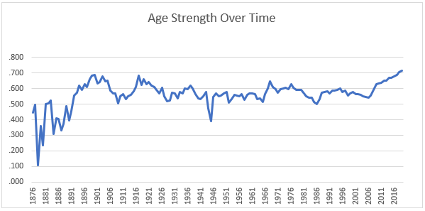
Let me interpret this chart for you, as best I understand it, warning you in advance that this leads to 16 paragraphs of not-very-interesting prose. I feel that I have an obligation to explain the data; not saying it is something you ought to read. When major league baseball began in 1876, there was some prehistory, some organization of the talent which preceded that, but the pathway from high school to the major leagues was in many cases a short one.
My language somewhat distorts the facts. We have to remember that in the 1870s, the 1880s, most young men did not go to high school. In my state, Kansas, very few towns HAD high schools until the early 20th century. Many other states have similar histories, some different, but many the same. Young men, if they went to school at all, stopped their schooling at about ages 12 or 13, going to work to help support the family. It wasn’t until the Depression, the 1930s, that MOST young men in Kansas finished high school, the change coming at that time because there was no work available anyway, so you might as well stay in school. That’s a half-century after 1880. The teenagers in the major leagues in the 1870s and early 1880s weren’t coming out of high school; they were coming out of coal mines and factories and off the farm.
My point, however, is that the pathway to the major leagues, for a talented young player, was in many cases a short one, and a lot of players were playing in the National League at ages 19, 20, 21, in some cases younger. There was, however, rapidly increasing competition for major league jobs, and this pushed the Age Strength Score up in the 1880-1883 era, up to what were then record-high numbers. In 1884 there was an upstart league, the Union Association, which has inexplicably been included in the records as a major league (although it clearly wasn’t), and, using the commonly available records and following the conventional designation of that as a major league, this causes the strength score to spike downward in 1884.
The American Association was also rapidly expanding at that time, and the upward pressure on the Age Strength score was blunted for some time by what seems in retrospect to be the chaotic nature of the sport in that era, with major rules changes almost every year. In 1890 there was another one-season shot at a major league, the Player’s League; more chaos. With the collapse of the Player’s League and the unification of the American Association and the National League into one league, the Age/Strength Scores hit record highs in 1892, 1893, 1894, 1896, 1898, 1899 and 1900.
The 1900 season was a sort of super-league. The number of teams was telescoping downward. From a peak of 30-some teams in the early 1880s, major league baseball had shrunk to one league and the National League had contracted to 12 teams and, for the 1900 season, down to 8. This one season of only 8 major league teams forced the weaker players out of the game, and caused the measured age/strength score to peak at .905 in 1900, the highest figure ever recorded until 2018. There was, however, something else going on, beyond the one-season contraction to 8 teams. The 1899 figure was also historically very, very high, higher than it was at any point from 1901 to 2017.
I would explain it this way. In non-professional sports, the peak age is clearly younger than 26 or 27. Other than professional athletes who are paid to retain and develop their athleticism, we tend to start to lose peak performance before age 26 or 27, probably more like 22 or 23. Professionalism changes that. There is an "amateur schedule" for athletic aging, and there is a "professional schedule."
In the late 1890s the shift from the amateur peak of 22-23 to the professional peak of 26-27 was clearly advancing; 19-year-old pitchers and 21-year-old superstars were basically disappearing by the late 1890s, pushing more players into the peak range. But the other side of that transition is the older stars who maintain a professional level of athletic skill until they are well past 30. By the late 1890s, the other side of the transition had not yet had time to develop. There were very few stars in their 30s by then, because not enough time had passed for a significant number of players to reach the upper ranges of the professional aging schedule.
Also, of course, we have to remember that the major leagues at that time—and even now, although less so—are relatively small groups of athletes. All of baseball, 1899, is not a large enough sample for the actual distribution of talent to be a true representation of the underlying forces.
Anyway, after the American League was founded in 1901. . .after it became a major league in 1901. . . the age spectrum changed very little until the 1920s. The reason it changed in the 1920s was: money. The explosion of interest in the game at the end of World War I/Babe Ruth’s coming to New York brought money into the game, which drove salaries up, which created a strong incentive for older players to stay in the game. Players who were making three, four thousand dollars a year in their prime now were making $10,000 a year in their 30s. They weren’t giving those jobs up without a fight. They weren’t retiring when they ordinarily might have. This kept many aging stars in the game in the late 1920s and into the early 1930s. The low figures of the late 1920s result from a very significant increase in the number of older stars in that period.
That era passed, and the age/strength spectrum—the concentration of players into the peak ages—went back up, reaching a peak of .885 in 1937, the highest figure since 1922. It was lower than that but in the same range until 1944-1945, World War II baseball, when many of the stars of the game were in Military Service, and significant numbers of older players and very young players were in the major leagues. Contemporary writers about that era exaggerated this effect, and portrayed baseball in that era as being the property of old men and children, which was not exactly true, but it was not 100% false, either. The age/strength score of 1945, .818, was the lowest since 1888, the lowest in 57 years.
After the war the age/strength score returned toward normal, reaching a peak of .874 in 1950, the highest figure between 1939 and 1967, but still not above the norms of the 1900-1920 era. The age/strength score does not reflect increasing concentration of players at peak ages in the 1950s.
One thing that very few people understand or think about is that World War II impacted the talent available to the major leagues for many years, at least until 1960 and possibly after. Many, many young men, including potential superstars, were killed in the war. Many more lost their athletic careers because they were in the Army in the crucial developmental years, ages 18 to 23. The talent base was thinned out. A player who was 18 years old in 1945 would not have been 40 until 1967.
A second factor operating in those years was the Bonus Baby Rule, which required that an amateur player signing for a good amount of money had to spend his first two full seasons on a major league roster. This put a small but significant number of very young players in the major leagues. Some of those bonus babies—Al Kaline, Curt Simmons, Johnny Antonelli, Del Crandall—picked up regular playing time almost immediately, and well away from their peak age.
After expansion the Age/Strength Scores dropped for a few years, but then began moving forward more strongly than they had in 50 years. Figures were high in the era 1967 to 1976.
Once free agency arrived, however, salaries exploded upward, causing a repetition of the Babe Ruth-era decline. Many more older players stayed in the game as salaries went upward. The age/strength score went from .888 in 1976 to .850 in 1986, the lowest figure since World War II.
From 1986 to 1995 the age/strength score recovered—that is, the concentration of players near the peak age increased—but then the steroid era started. Steroid use extended the careers of many aging players, thus driving the age/strength score downward. From one cause and another, the concentration of players at peak ages increased very little from 1900 to 2005.
Since 2006 the concentration of talent at the peak ages has increased steadily, and to record levels.
Of course, the concentration of talent around the peak ages is by no means a perfect measure of the strength of a league. Many different things cause the quality of competition in a league to become stronger or weaker. This is just one of those things. This is the first of a series of three articles. We’ll continue the series tomorrow with a study of the domination of the game by a limited number of stars.
The Quality of Competition Over Time
An Index of Star Domination
In yesterday’s article I looked at the concentration of talent in the major leagues at or near the peak ages, and at the effect that this has on the quality of competition over time. A second objective standard for quality of competition is star domination. A low-level league is typically dominated by a few players. I used to coach a team of 8-year-olds. I had one kid on my team who played shortstop, pitched sometimes, and would hit one or two home runs a game, usually hitting doubles or triples when he didn’t; I don’t know what his average was, but it was probably .700. At shortstop, he was absolutely fantastic. There were other kids on the team who struck out in almost every at bat. I suspect that is common in every league of 8-year-olds.
By the time they are 12 or 13, half of the kids have dropped out, and the pitching and fielding have gotten good enough that that special kid probably only hits .500 or .550. By the time they’re in high school, the High School baseball team is composed of all of those kids from all of the different 8-year-old teams, so the best player probably hits .400 or .450, and by the time you thin it out a couple of more times to make a college team, the best player in the league may be a .370 or .380 hitter and playing third base, rather a .700 hitter and playing shortstop.
The Harvard paleontologist Stephen Jay Gould compared the narrowing of the talent gaps in baseball, over time, to the standardization of sizes and capabilities within a species. In nature you have animals that weigh 2,000 pounds and animals that weigh a fraction of an ounce, but within a species you would very rarely have, for example, a 4-pound adult and a 10-pound adult. Probably you would almost never have a 4-pound adult and a 40-pound adult of the same species. In nature there are animals that fly, animal that walk, animals that crawl, animals that swim, animals that burrow, etc., but you don’t get members of the same species, one of whom flies and the other of whom crawls. The same in baseball: over time, the extremes within the "species" of baseball players disappear, and skill levels converge.
I don’t know if that made sense, and anyway I am describing a phenomenon that probably you all understood before I started describing it. In early baseball the best players dominated to a significantly greater extent than they do now. How much greater?
We can use Win Shares to study that issue. I started with a big file of every player’s Win Shares every year or, in some cases, estimated Win Shares. I experimented with like a hundred different ways of forming an "index of star domination" based on Win Shares, doing stuff like squaring each player’s win shares and then dividing the sum of the squares by the sum of the totals; when the best players have higher scores the ratio goes up. None of that stuff worked as well as I wanted it to, and I came back to a very simple index.
In 1876 there were 8 teams in the National League, which won a total of 257 games, or 771 Win Shares; three Win Shares for each win. The eight best players in the league (George Bradley, Al Spalding, Tommy Bond, Jim Devlin, Ross Barnes, Candy Cummings, Jack Manning and Bobby Mathews). . the eight best players in the league had a total of 293 Win Shares, which is 38% of the league total. We define the index as "the total number of Win Shares earned by the X best players in the league, where X is the number of teams in the league."
This index declined rapidly in the 19th century. It dropped under 30% for the first time in 1881, and was never over 30% after 1881. It dropped under 20% for the first time in 1888, and has never been over 20% since 1888. It dropped under 15% for the first time in 1891, and was permanently under 15% beginning in 1898.
In the 20th century this number declined gradually but slowly. . .well, here it is by decades, decade averages:
|
From
|
To
|
Average
|
|
1900
|
1909
|
13.7%
|
|
1910
|
1919
|
13.1%
|
|
1920
|
1929
|
13.3%
|
|
1930
|
1939
|
13.7%
|
|
1940
|
1949
|
12.9%
|
|
1950
|
1959
|
12.4%
|
|
1960
|
1969
|
11.7%
|
|
1970
|
1979
|
11.2%
|
|
1980
|
1989
|
10.8%
|
|
1990
|
1999
|
11.3%
|
|
2000
|
2009
|
11.1%
|
|
2010
|
2019
|
10.6%
|
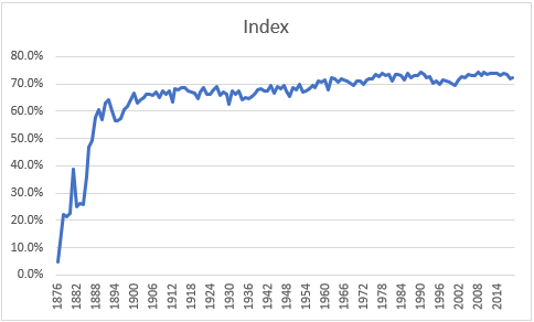
For the purpose of evaluating talent over time, I need a number that goes up when the league gets stronger, rather than a number that goes down when the league gets stronger. We can create that by just subtracting this percentage from 1.000. That creates the following chart.. . .index of star domination over time:
|
Year
|
Index
|
|
Year
|
Index
|
|
Year
|
Index
|
|
Year
|
Index
|
|
1876
|
62.0%
|
|
1912
|
85.4%
|
|
1948
|
86.9%
|
|
1984
|
89.2%
|
|
1877
|
64.6%
|
|
1913
|
87.3%
|
|
1949
|
86.2%
|
|
1985
|
88.7%
|
|
1878
|
68.9%
|
|
1914
|
87.1%
|
|
1950
|
87.4%
|
|
1986
|
89.6%
|
|
1879
|
68.5%
|
|
1915
|
87.4%
|
|
1951
|
87.2%
|
|
1987
|
88.9%
|
|
1880
|
69.1%
|
|
1916
|
87.5%
|
|
1952
|
88.0%
|
|
1988
|
89.3%
|
|
1881
|
75.6%
|
|
1917
|
86.9%
|
|
1953
|
86.8%
|
|
1989
|
89.2%
|
|
1882
|
70.1%
|
|
1918
|
86.8%
|
|
1954
|
87.0%
|
|
1990
|
89.7%
|
|
1883
|
70.5%
|
|
1919
|
86.7%
|
|
1955
|
87.4%
|
|
1991
|
89.4%
|
|
1884
|
70.3%
|
|
1920
|
85.8%
|
|
1956
|
87.8%
|
|
1992
|
88.9%
|
|
1885
|
74.3%
|
|
1921
|
86.8%
|
|
1957
|
87.5%
|
|
1993
|
89.1%
|
|
1886
|
78.7%
|
|
1922
|
87.4%
|
|
1958
|
88.5%
|
|
1994
|
88.1%
|
|
1887
|
79.7%
|
|
1923
|
86.5%
|
|
1959
|
88.3%
|
|
1995
|
88.5%
|
|
1888
|
83.1%
|
|
1924
|
86.5%
|
|
1960
|
88.6%
|
|
1996
|
88.0%
|
|
1889
|
84.3%
|
|
1925
|
87.2%
|
|
1961
|
87.1%
|
|
1997
|
88.6%
|
|
1890
|
82.8%
|
|
1926
|
87.7%
|
|
1962
|
88.9%
|
|
1998
|
88.4%
|
|
1891
|
85.1%
|
|
1927
|
86.4%
|
|
1963
|
88.8%
|
|
1999
|
88.2%
|
|
1892
|
85.8%
|
|
1928
|
86.8%
|
|
1964
|
88.3%
|
|
2000
|
88.0%
|
|
1893
|
84.1%
|
|
1929
|
86.5%
|
|
1965
|
88.7%
|
|
2001
|
87.8%
|
|
1894
|
82.7%
|
|
1930
|
85.1%
|
|
1966
|
88.5%
|
|
2002
|
88.6%
|
|
1895
|
82.7%
|
|
1931
|
87.0%
|
|
1967
|
88.4%
|
|
2003
|
89.0%
|
|
1896
|
82.9%
|
|
1932
|
86.5%
|
|
1968
|
88.0%
|
|
2004
|
88.9%
|
|
1897
|
84.3%
|
|
1933
|
87.0%
|
|
1969
|
87.8%
|
|
2005
|
89.4%
|
|
1898
|
84.7%
|
|
1934
|
85.6%
|
|
1970
|
88.5%
|
|
2006
|
89.3%
|
|
1899
|
85.7%
|
|
1935
|
86.0%
|
|
1971
|
88.4%
|
|
2007
|
89.3%
|
|
1900
|
86.7%
|
|
1936
|
85.9%
|
|
1972
|
87.9%
|
|
2008
|
89.7%
|
|
1901
|
85.2%
|
|
1937
|
86.2%
|
|
1973
|
88.6%
|
|
2009
|
89.3%
|
|
1902
|
85.7%
|
|
1938
|
86.6%
|
|
1974
|
88.8%
|
|
2010
|
89.8%
|
|
1903
|
86.0%
|
|
1939
|
87.1%
|
|
1975
|
88.8%
|
|
2011
|
89.3%
|
|
1904
|
86.5%
|
|
1940
|
87.3%
|
|
1976
|
89.4%
|
|
2012
|
89.6%
|
|
1905
|
86.4%
|
|
1941
|
87.0%
|
|
1977
|
89.1%
|
|
2013
|
89.6%
|
|
1906
|
86.4%
|
|
1942
|
86.9%
|
|
1978
|
89.5%
|
|
2014
|
89.6%
|
|
1907
|
86.8%
|
|
1943
|
87.7%
|
|
1979
|
89.2%
|
|
2015
|
89.3%
|
|
1908
|
86.0%
|
|
1944
|
86.7%
|
|
1980
|
89.4%
|
|
2016
|
89.5%
|
|
1909
|
86.9%
|
|
1945
|
87.6%
|
|
1981
|
88.5%
|
|
2017
|
89.3%
|
|
1910
|
86.6%
|
|
1946
|
87.3%
|
|
1982
|
89.4%
|
|
2018
|
88.8%
|
|
1911
|
86.9%
|
|
1947
|
87.8%
|
|
1983
|
89.5%
|
|
2019
|
88.9%
|
As you can see, the index hit 89% in 1976 and has generally been over 89% since 1976, but has never hit 90%.
If we exaggerate the data to make the patterns more visible, we have this:
OK, that basically ends what I have to say here which is relevant to my general topic, but it introduces a side point that I will make in closing.
Up until 1969, 19th century baseball was almost universally discounted as being "major league" baseball. It was regarded as an antecedent to major league baseball, rather than as the genuine article. A line was drawn in 1900. 19th century records for things like batting average, stolen bases, runs scored and pitcher’s wins were almost universally ignored or discounted. When the Macmillan Encyclopedia was published in 1969—a massive, groundbreaking, and thoroughly marvelous effort—but the editors of that publication decided that that was an arbitrary distinction, and that no distinction would be made between 19th century and "modern" baseball. Post-1970 baseball research has followed that practice, and almost everyone now regards 19th century baseball as major league baseball.
This was a terrible mistake, which has polluted baseball history ever since. 19th century baseball has basically no characteristics consistent with the description of it as major league baseball. The argument for this mindless mis-characterization is that the 20th century line was an arbitrary distinction, that nothing exactly happened at that moment that justifies putting everything before then in one class and everything after that in another.
Well, perhaps, but the line between adulthood and childhood is an arbitrary distinction, too. Nothing EXACTLY happens EXACTLY on your 18th birthday or your 21st birthday that makes you a different person than you were the day before, but the fact is that childhood and adulthood are quite clearly different things with very different characteristics, even though we may have to rely on an ultimately arbitrary distinction to draw the line between them.
And the same here: 19th century baseball and major league baseball are very clearly different things, even though we may have to rely on an ultimately arbitrary distinction to draw the line between them.
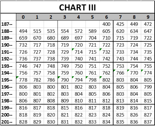
These two charts—the one that I published yesterday, and the one that I published today—demonstrate visually how true that is. This is the chart from yesterday:
And this is the one from today:
One can see in both cases, based on entirely objective measurements, that these performance measures in 19th century baseball are (a) extremely volatile and (b) moving upward at a forceful rate. But in both cases, once we hit 1900, the charts flatten out suddenly. Baseball becomes stable. Comparisons of 1960 to 1900 are much more relevant and more reliable than comparisons of 1890 to 1880.
Just like adulthood. If you graph, for example, a person’s height and weight, or their vocabulary, or in most cases their understanding of the world, that graph moves in violent jerks until the person becomes an adult, and then it flattens out suddenly—not that you may not go from 180 pounds to 280 and back to 210, but (a) there are no parallel changes in your height, and (b) even THAT change is very small proportionally compared to the changes in your weight that occur from birth until your 18th birthday. 19th century baseball is the childhood that preceded major league baseball. It isn’t major league baseball itself.
The Quality of Competition Over Time
Presumptive Strength
The operating theory here is that (1) there is a "Quality of Competition Number" for every league which has ever existed, and that (2) that Quality of Competition Number is ultimately knowable and discoverable, although it is presently unknown. Let’s call it a Quoc Score. It should be entirely possible, I believe, to derive Quoc Scores for every league since 1900, such that one could say with objective reference points that the National League in 1952 was 9% stronger than the American League in 1917, or that the American League in 1984 was 6% stronger than the National League in 1952, or whatever.
One should be able to say not only what the relative strength of each major league is to the other, but what the relative strength is of major leagues to minor leagues and of professional leagues to amateur leagues. One should, ultimately, be able to compare a player in the Western Association in 1922 to a player in the Southeast Conference in 2017, and say "OK, Player A is 48% better than the average player in the Western Association in 1922 and Player B is 14% better than the average player in the Southeast Conference in 2017, but the Southeast Conference in 2017 is 37% stronger than the Western Association in 1922, so in constant terms Player B is about 6% better than Player A." There is no reason why that can’t be done.
Well, there is one stumbling block that you can’t ultimately get around. You can only do that if they are playing the same game. If the game changes so much that it’s like comparing a baseball player to a basketball player, then the concept of a unified scale breaks down. I’m not saying that it is impossible to compare the quality of a basketball player to the quality of a baseball player; I am saying that it is a different challenge. Comparing a basketball player to a baseball player is more of an allegorical comparison, rather than a common standard comparison. Comparing Player A from the Western Association in 1922 to Player B from the Southeast Conference in 2017, one can realistically ask "If these two players were in the same league, which one would probably be the better player?" If you ask that about Michael Jordan and Tony Gwynn, then the answer depends on whether you are playing baseball or playing basketball. Michael Jordan was clearly a better basketball player than Tony Gwynn, who was a great college basketball player but not Michael Jordan, and Tony Gwynn was clearly a better baseball player than Michael Jordan. You can create an allegorical standard, and compare Michael Jordan to Babe Ruth, but you can’t create a common standard which realistically puts them both on the same field unless they are playing the same game.
My belief is that baseball changed so much from 1876 to 1895 that it is probably impossible to create a common standard between baseball in 1876 and 1895. It’s not really the same game. Comparing 1900 and 2019, however, it is essentially the same game, so it should be possible to create a common standard, and assign every league since 1900 a Quoc Score, a common standard number for the Quality of Competition. The only reason that it hasn’t been done is that
1) It would be a tremendous amount of work, and
2) Nobody except me seems to be interested in working on this problem.
But theoretically, it could be done. I my head, I know HOW it could be done; I just can’t do it all by myself.
Last Sunday I ran a Twitter poll asking people whether they thought the average major league player in 2019 was 10% better than in 1969, 25%, 50% or no better. The poll received 1,272 votes in two hours and sparked a significant amount of debate, suggesting to me that there is significant public interest in the issue, despite the lack of interest in it in sabermetric journalism.
Many, many different things effect the Quality of Competition in the Major Leagues over time. Because it is a super-competitive industry which makes concerted efforts to drive out weakness and build on strengths, most of these things tend, over time, to make the quality of competition better.
I was thinking yesterday about smoking, about the tremendously high cost of smoking. I was thinking about this because a kid I knew in High School died recently. He had always been a heavy smoker, and this blighted his life. It destroyed his teeth, caused many different health problems, and probably cost him hundreds of thousands of dollars in direct costs and health costs.
Although we rarely think about this, major league players (with a few exceptions) don’t smoke cigarettes anymore. When I was a kid, they did; they would advertise cigarettes, and you would sometimes see them smoking in the dugout between at bats.
Suppose that you have two teams, otherwise equal, but one team smokes and the other team does not. Which team will win more games? It’s probably not MUCH of a difference over the course of one season, but probably the non-smoking team would win an extra game or two. If that is true, then the elimination of smoking from the athletic population improves the quality of competition.
My point is, probably hundreds of things have happened over time which have impacted the overall quality of competition in baseball. A few of those effects can be documented; many of them can’t.
For those that can’t, we can fill in the blanks with a presumptive value. We will start with three assumptions:
1) That there was a starting point for the quality of competition in major league baseball in 1876,
2) That the quality of competition improved rapidly until about 1900, and
3) That the quality of competition has continued to improve since 1900, but at a more moderate rate.
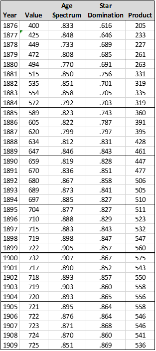
For the 1876 starting point, let us pick the number "400". Why we are picking 400 rather than 100 or 78.39 or 3,655 will be explained at the end of the article. Anyway, let us suppose that we then increase this level by 25 points in 1877, 24 in 1878, 23 in 1879, etc. . .until we are only increasing it by one per season in 1901, and then we continue to increase it by one per season after it reaches that level in 1901. The values below (Chart I) match the three assumptions given above. That gives us a "presumptive talent level" chart over time that looks like this:
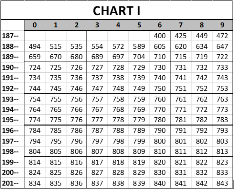
I hope that is clear; the presumptive number for 1928 is 752. Anyway, various other things have happened that create presumptive changes in the quality of play. I’ll deal with three of them, which are:
1) Expansions,
2) The breaking of the color line, and
3) Wars.
Expansion first. In 19th century baseball new teams were being added and teams were folding and going out of existence constantly, in several cases in the middle of a season, but we’re not going to worry about those. There were 8 teams in 1876 and 12 in 1899. On the scale of the changes happening at that time, the net change is not significant, and the individual changes are too numerous to deal with one at a time.
Beginning with the 20th century, however, we will assume that each expansion team that is added dilutes the quality of talent and thus sets the quality of competition backward by what we will say is two points for each team that is added. For the sake of consistency, when teams are subtracted—which hasn’t happened in the last 100 years—but when teams are subtracted, we will add 2 points per team to the Quoc Score. This means that we:
a) Add 8 points in 1900, when four teams were eliminated from the National League,
b) Subtract 16 points in 1901, when the American League launched (and raided stars from the National League),
c) Subtract 16 points in 1914, when the Federal League launched,
d) Add 16 points in 1916, when the Federal League folded,
e) Subtract 4 points in 1961, when the American League expanded by two teams,
f) Subtract 4 points in 1962, when the National League expanded by two teams,
g) Subtract 8 points in 1969, when both leagues expanded,
h) Subtract 4 points in 1977, when the American League added teams in Seattle and Toronto,
i) Subtract 4 points in 1993, when the National League added teams in Colorado and Florida, and
j) Subtract 4 points in 1998, when new major league teams were created in Tampa Bay and Arizona.
Understanding that the process of gradual improvement still occurs, so that when we subtract four points in 1961, the net loss is only three points, because the annual one-point incremental gain is still registered. If we make those assumptions, then that creates this chart of the quality of competition over time:
Prior to 1947, black players were de facto banned from the major leagues. It may be presumed that allowing black players to play in the majors significantly improved the quality of play, in that there proved to be (ahem) several black athletes who were capable of playing in the major leagues. Ironic understatement; don’t take it seriously.
The effects of the breaking of the color line were not instantaneous. The line cracked slowly over a course of, let us say, ten years. To represent this, let’s add 3 points a year from 1947 to 1956, a total of 30 points. Of course, some people will tell me that this isn’t a large enough adjustment, but then, if I added 150 points, some people would tell me that that wasn’t enough. 30 points is a pretty substantial change in the level of play. Adding those points gives us this chart:
And finally, wartime. During World War II (1941-1945, but starting after the end of the season in 1941). . . during World War II, most of the top stars in baseball were in the Army, leaving teams to be staffed by players who were older, younger, or who had deferments for some reason. We will recognize this effect by subtracting 3 points per season from 1942 to 1945, then adding 3 points per season back in from 1946 to 1949, as the game gradually recovered from this effect. (The longer the war went on, 1942-1945, the more stars were taken out of circulation. As to why I restored the game to 100% by 1949, rather than adding back in one point a year from 1946 to 1957, I really don’t know, but it’s too late for me to go back and re-do all of my estimates.)
Anyway, the Korean War also had a substantial effect on the talent pool; less dramatic and less remembered, but nonetheless substantial. Among the major league stars who were lost to the majors during the Korean conflict were Ted Williams, Willie Mays, Whitey Ford, Don Newcombe, Curt Simmons and others—major stars. We will recognize this effect by taking away 2 points per season in 1951, 1952 and 1953, then adding those points back in in 1954, 1955 and 1956. That creates a fourth chart of the quality of competition over time:
There will be a Chart V. We have one more set of adjustments that we have to make.
These are presumptive numbers. But in the last two days, we have developed two sets of numbers which are not assumptions, but objective scores derived from (a) the age spectrum of major league players, and (b) an index of the domination of the game by its star players.
How do we combine the presumptive numbers with the objective information? There are many different ways that it could be done, depending on issues such as "are these independent factors, or co-dependent?" Some of them are completely independent; some of them are co-dependent. There’s actually no clear answer to the question, but my choice was to treat them as independent measures—that is, to assume that the presumptive Quoc Score does not reflect the two things we have measured. That being the case, we modify the numbers in Chart 5 by the two factors measured before, creating a new set of Scores.
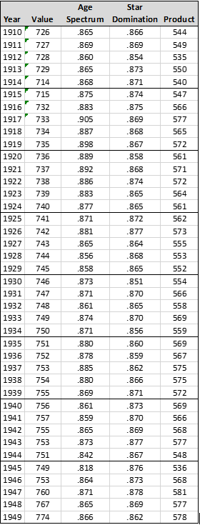
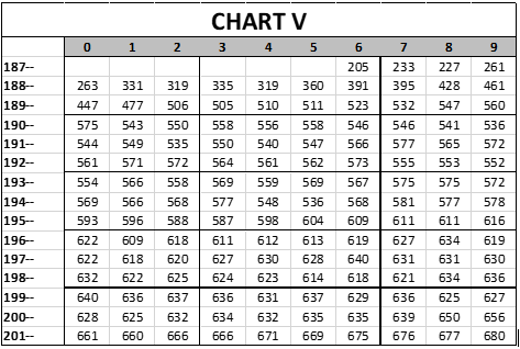
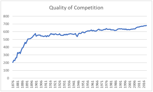
In 1876, the Presumptive Score is 400, the Age Spectrum Analysis Score is .833, and the Star Domination Score is .616. Multiplying 400 times .833 and the result times .616, we reach a new score of 205:
|
Year
|
Value
|
Age Spectrum
|
Star Domination
|
Product
|
|
1876
|
400
|
.833
|
.616
|
205
|
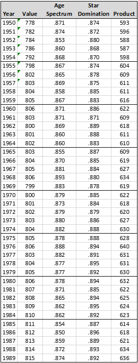
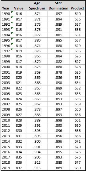
In 2019, multiplying the Presumptive Score (837) by the Age Spectrum Analysis (.915) and the Star Domination (.889), we reach a Quoc Number of 680:
|
Year
|
Value
|
Age Spectrum
|
Star Domination
|
Product
|
|
2019
|
837
|
.915
|
.889
|
680
|
These are the final numbers for this round of analysis—205 for 1876, and 680 for 2019. These are these Quoc Scores or every year, 1876 to 2019:
Converting this into the chart form used before, we have this:
All of that is supposed to match the previous chart, but I had to manually type in all of the numbers, so there is probably a typo in there somewhere. That doesn’t matter very much, in that we are so far away from the end product of this research that anything we produce now is just a sand pattern on the beach, which will be washed away by the next piece of research. This is a line graph of the quality of competition over time:
The other issue which I left hanging before has to do with why did we start the chart at 400 raw Quoc points, rather than some other number? How do I know that 400 is the right number?
I don’t know, and I am sure that it isn’t exactly the right number. But when you don’t know what the right number is, then you have to put in place a number that seems reasonable to you. What it comes down to, then, is what do you believe?
If you pick different numbers, different ratios, then you can wind up implicitly arguing that, let’s say, Mickey Mantle couldn’t play in the major leagues today. We can establish a ratio of the performance of Mickey Mantle to the league average in 1956, and then we can move the league average, and we can say that Mickey Mantle was, let’s say, 80% better than the average player in 1956, but that, adjusting for the quality of competition, this would only be about 61% better than the average player in 2019. That’s about what I believe, but if we make the ascent of quality over time much sharper, then we can wind up arguing that 80% better than average in 1956 would be 25% below average in 2019. The fact is that no one really knows, at this time, what that ratio would be.
BUT it does not come down to what I believe, exactly; rather, it comes down to what I believe that future research will show. I believe that future research will demonstrate, most likely, that while the average player of the 1950s is well below the quality of the average player in today’s baseball, nonetheless the great player from the 1950s would still be a very good player today. I chose the values that I did, in the presumptive Quoc Numbers, because they represent what I most believe to be true.
Thanks for reading.